
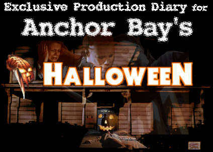
Production Diary: Halloween
The Beginning
It is only a few short weeks until the Halloween Special Edition finally hits the retail shelves across the US, and I know many of you can hardly wait to get their hands on this fabulous 2-disc Special Edition from Anchor Bay Entertainment. The definite number for the print-run of for the limited 2-disc edition, containing the film’s theatrical version and the broadcast cut, has been determined by now. Originally planned as a limited edition with 21.000 units, at one point I had heard rumors about 40.000 units. A few days ago now, Anchor Bay told me the final number of the print-run for the limited, numbered 2-disc box. “We will print 30.000 units of the 2-disc set”, Jay Douglas tells me on the phone, and I assure him they will without a doubt fly off the shelves according to the response we have received from this Production Diary so far. It seems as if everyone who has ever enjoyed “Halloween” will pick this one up, and I would highly recommend pre-ordering this title before retailers are out of stock.
Today I would like to give you a visual idea of how good the new “Halloween” looks. It is one thing if you have someone telling you that it looks so much better, that the colors are so much richer and so forth, but seeing is believing, correct? For this installment in our Production Diary update I have prepared some comparative screenshots from the original “Halloween” release Anchor Bay put out in 1997 and from the upcoming THX certified version. Unfortunately some of the differences are not as striking on these screenshots as they are when you see the image quality of the DVD on a large TV screen. The definition is stunning and it feels as if the picture leaps off the screen any minute. One of the things you also can’t see in the screenshots is the complete lack of motion artifacts.
 Especially the previous DVD release of “Halloween” as riddled with these nuisances that turn every movement on screen into a jittery or blurry mess. The 2/3 pull-down used to convert 24-frames-per-second film transfers to a 25- frames-per-second video transfer can introduce a great deal of problems if not done properly, and once again the THX approved version of the film is absolutely fantastic in that respect.
 Let’s take a look at one of the first images of the film above, taking from the opening credits. Accompanied by John Carpenter’s eerie piano track, these titles with their bold colors easily bleed. As expected, the original transfer exhibits a great deal of such bleed, totally washing out the letters, which gives them an unintentional hallow. Unfortunately this effect is not quite as visible in the screenshot as on an actual television screen. In the newly restored version, there is not a sign of hallow or bleeding. The letters stand out boldly and the edges are razor sharp. At this point I zoomed into the picture the first time I watched the “Halloween” disc and if it weren’t for the animation of the pumpkin, I could have sworn the lettering was a still image, that’s how rock solid the picture and the compression is.
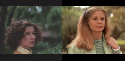
This next screenshots I prepared are taken from one of the rare daylight outdoor scenes during the beginning of the film. What is immediately noticeable here upon side-by-side comparison is how heavily blue-tinged the old transfer was looking, giving the overall scene a cold, unbalanced look. But also if you compare the skin tones of the two versions, it is instantaneously obvious what an incredible job Adam Adams has done during the color correction process of the new transfer. Now, these and all other daylight scenes outdoor scenes feature friendly, rich and lively colors with strong hues, perfectly contrasting the horror to come.
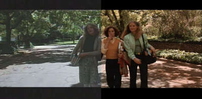 One thing that has always been a problem in the initial release of the film was the fact that the black level was set incorrectly, turning all blacks into grays and as a result washing out the shadows and contrast of the entire image. Just take a look at the lush and subtle coloring in the trees in this shot as opposed to the flat and dull looking unrestored version.
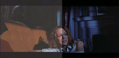
A look at some of the dark interior shots in the climactic scenes of the film now reveal a new-found colored lighting set-up that was practically lost in the previous transfer of the film. The entire background was a muddy gray without detail or coloration. In the new, restored version of the film, there is a strong blue saturation that was originally created by John Carpenter but lost during the film’s transfer to video. But also the shadow detail is noticeably higher, although this is not apparently visible in the screenshot. The colors are strong and the blacks solid, giving scenes like this one a very powerful feel.
 One thing that also plays to the restored “Halloween’s” advantage is the increased level of detail found in the 16×9 enhanced transfer. With many lines of additional resolution over the previous transfer, especially in anamorphic mode the increase in detail is sure to blow your socks off! But even on traditional 4:3 screens, this increased level in detail is noticeable and I have not been able to see any noticeable aliasing artifacting.
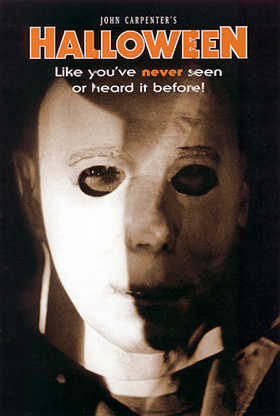
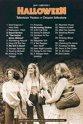
Before I go, I also wanted to give you a look at the inlay cards Anchor Bay has prepared for the Special Edition. The front is graced by an interesting head shot of Michael Myers while the back contains the disc’s numerous chapter stops over a shot of Nancy Loomis, PJ Soles and Jamie Lee Curtis, all of it done in a stylish sepia-tone print.
That’s all for this time. I hope you agree with me that this new transfer of “Halloween” looks simply spectacular. In our next and final update we will give you a long awaited look at some of the widescreen material from the television version of “Halloween”, as well as menu screens from this separate disc – so make sure to stop by!


Leave a comment
You must be logged in to post a comment.